CMYK uses a combination of cyan, magenta, yellow, and black inks to create a wide range of colors in print, ideal for full-color images; Pantone, on the other hand, offers a standardized color matching system with specific ink formulas to ensure color consistency across different materials and print jobs. Choosing between CMYK and Pantone depends on your need for color accuracy versus cost-effectiveness and the complexity of the print project.
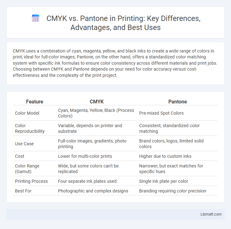
Table of Comparison
| Feature | CMYK | Pantone |
|---|---|---|
| Color Model | Cyan, Magenta, Yellow, Black (Process Colors) | Pre-mixed Spot Colors |
| Color Reproducibility | Variable, depends on printer and substrate | Consistent, standardized color matching |
| Use Case | Full-color images, gradients, photo printing | Brand colors, logos, limited solid colors |
| Cost | Lower for multi-color prints | Higher due to custom inks |
| Color Range (Gamut) | Wide, but some colors can't be replicated | Narrower, but exact matches for specific hues |
| Printing Process | Four separate ink plates used | Single ink plate per color |
| Best For | Photographic and complex designs | Branding requiring color precision |
Understanding CMYK and Pantone
CMYK is a subtractive color model using cyan, magenta, yellow, and black inks to produce a wide range of colors in print, making it ideal for full-color photographic images. Pantone refers to a standardized color matching system with specific ink formulas designed for precise, consistent color reproduction across different print jobs and materials. Understanding the differences helps designers choose CMYK for flexible, budget-friendly printing and Pantone for exact color matching, especially in branding and logo design.
The Basics of CMYK Color Model
The CMYK color model uses four primary inks--Cyan, Magenta, Yellow, and Key (Black)--to create a wide spectrum of colors through subtractive color mixing in printing processes. Unlike Pantone's spot color system, CMYK is ideal for full-color, process printing where colors are produced by combining varying percentages of each ink. Your choice between CMYK and Pantone depends on the precision and consistency required for your printed materials.
What Is the Pantone Matching System?
The Pantone Matching System (PMS) is a standardized color reproduction system widely used in printing and manufacturing to ensure color consistency across different materials and processes. It assigns unique codes to specific colors, allowing designers and printers to match exact shades regardless of device or location. Unlike CMYK, which mixes cyan, magenta, yellow, and black inks to create a range of colors, Pantone uses pre-mixed inks to produce precise, consistent colors, especially useful for branding and logos.
Key Differences Between CMYK and Pantone
CMYK uses a four-color process (cyan, magenta, yellow, black) to create a wide range of colors through mixing, making it ideal for full-color printing with smooth gradients. Pantone, also known as spot color printing, uses pre-mixed inks to produce precise, consistent colors that cannot be replicated exactly with CMYK, ensuring brand color accuracy and vibrancy. Your choice between CMYK and Pantone depends on whether you prioritize cost-effective color mixing or exact color matching for logos and brand materials.
Printing Applications: When to Use CMYK or Pantone
CMYK is ideal for full-color printing in projects requiring a wide color range, such as brochures, photographs, and marketing materials. Pantone is preferred for precise color matching in branding, logos, and products requiring consistent color reproduction across different print runs. You should choose Pantone when exact color fidelity is crucial, while CMYK suits complex, multi-colored images.
Color Accuracy and Consistency
CMYK color mode relies on a combination of cyan, magenta, yellow, and black inks, which can lead to variations in color accuracy and consistency due to differences in printers and materials. Pantone uses standardized spot colors created from pre-mixed inks, ensuring precise color matching and uniformity across different print runs and substrates. Your choice between CMYK and Pantone depends on whether exact color reproduction or cost-effective, flexible printing is more critical for your project.
Cost Considerations: CMYK vs Pantone Printing
CMYK printing offers lower upfront costs as it uses four standard ink colors, making it ideal for full-color projects with budget constraints. Pantone printing incurs higher expenses due to specialized, pre-mixed inks and additional setup fees for each unique color, but delivers precise color matching crucial for brand consistency. Businesses must weigh the cost-effectiveness of CMYK's versatility against Pantone's premium accuracy to optimize printing budgets.
Design Workflow Implications
CMYK color mode relies on combining cyan, magenta, yellow, and black inks, making it ideal for full-color printing but less predictable in color accuracy across different devices. Pantone provides standardized spot colors that ensure consistent and precise color matching, simplifying communication between designers and printers. Understanding these differences in your design workflow helps streamline production and maintain brand color integrity.
Advantages and Disadvantages of Each Color Model
CMYK color model excels in full-color printing processes, offering a wide range of printable colors through the combination of cyan, magenta, yellow, and black inks, making it ideal for photographs and complex images but sometimes resulting in color inconsistencies across different printers. Pantone, known for its spot color system, provides precise and consistent color matching by using predefined ink formulas, which ensures brand color accuracy but can be more costly and less flexible for designs requiring gradient or multi-color effects. Understanding your project's color demands helps you choose between CMYK's versatility and Pantone's exact color fidelity, optimizing print quality and brand representation.
Choosing the Right Color System for Your Project
Choosing between CMYK and Pantone depends on the project's color accuracy and consistency requirements. CMYK is ideal for full-color printing with a wide range of hues, while Pantone offers precise, standardized spot colors for brand consistency and special finishes. For marketing materials where exact color matching is crucial, Pantone ensures uniformity across different print runs and substrates.
CMYK vs Pantone Infographic